Guide and layout logic
Apollo Group TV EPG is best understood as a layout system, not a promise that every device displays the same screen. The useful question is how the guide, content sections, metadata, search signals, filters and player handoff help a viewer move from browsing to playback.
Apollo Group TV EPG and Content Layout at a Glance
The phrase EPG means electronic program guide, but this page keeps the explanation specific to Apollo's navigation logic. A separate guide already explains the general EPG concept, including schedule data and time-based listings. Here, the focus is narrower: how a viewer can think about layout clues inside an Apollo viewing experience.
Because app versions and devices can change, this is not a button-by-button tutorial. It does not claim a fixed button name, fixed row order or fixed screen design. Instead, it explains seven clues that help the reader understand what a layout element is probably doing.
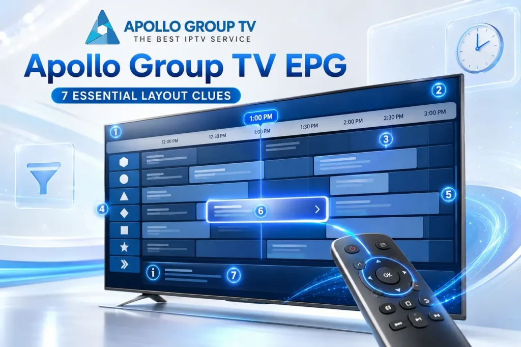
Clue 1: Time Rows Show the Guide Logic
Time rows help the viewer understand that the guide is organized around schedule position. A row can suggest what is current, what is coming next, or where a listing sits in the visible timeline. This is the layout role of the guide, not a full technical explanation of EPG data.
For Apollo Group TV EPG reading, the important clue is the relationship between time, listing and selection. If a row behaves like a schedule row, it is helping the viewer choose by time context.
The practical mistake is treating every row like a folder. A time-based row is usually asking the viewer to think in sequence: current slot, nearby slot, then selection. That is different from browsing a category shelf.
Use this clue only to understand timing context inside the layout.Clue 2: Content Sections Separate Viewing Modes
Content sections help the viewer avoid mixing different kinds of browsing. One area may behave like a schedule-based live guide, while another may behave like a browsing shelf, folder or on-demand area. The exact label can vary, but the purpose is to prevent every item from appearing in one flat list.
This clue stays conceptual because its job is not to compare every viewing mode in depth. The point is simpler: layout sections give the viewer a clue about how that area should be navigated.
If an area feels schedule-led, the viewer should scan by time and row position. If an area feels folder-led, the viewer should scan by section label and item grouping. That simple distinction keeps this page away from a full viewing-mode comparison.
A section is a navigation clue, not proof of a fixed menu name.Clue 3: Metadata Helps Identify What Each Item Means
Metadata is the descriptive layer around a listing or item. It may include a title label, timing clue, category clue, short description, progress state or other context depending on the app surface. The viewer uses that information to decide whether an item is relevant before selecting it.
The practical value is reducing guesswork. A layout with useful metadata helps separate "this is the item" from "this is the section" and from "this is the action." That distinction matters when the screen contains many rows or cards.
Metadata also protects the viewer from opening items only to learn what they are. When labels, timing cues and short context are readable, the browsing surface becomes a decision surface instead of a guessing surface.
No protected listing examples or copied interface text are needed to explain the metadata role.Clue 4: Search Signals Depend on Available Labels
Search is only as useful as the labels available to the app surface. If the layout contains clear names, categories or metadata fields, search can feel more direct. If labels are limited or the user searches with a different wording pattern, the result may feel less obvious even when content organization is working normally.
This is why search should be understood as a label-matching clue, not a magic inventory scanner. The viewer enters a term, the app surface compares it against available labels, and the layout returns whatever matches that search behavior.
A good way to read search results is to ask what field probably matched: a title label, a section label, a category label or another visible descriptor. That keeps expectations realistic without tying the explanation to an outside technical page or making claims about Apollo's private app design.
Search explains discovery behavior; it should not become a troubleshooting section.Clue 5: Filters Narrow the Screen Without Changing Access
Filters help narrow what is visible on the screen. They may reduce a long browsing surface by section, label, category or another visible clue. The key point is that a filter changes what the viewer is looking at; it does not create new access by itself.
That boundary prevents confusion. If a viewer applies a filter, the layout may become easier to scan, but the underlying account path and available access are separate parts of the viewing flow. A filter is a navigation aid, not a service change.
Filters are most useful when a screen has too much visible choice. They create a smaller view of the same organized surface, which helps the viewer move from broad browsing to a more specific selection path.
Use filters to explain organization, not access promises.Clue 6: Player Handoff Starts After Selection
Browsing and playback are different moments. The layout helps the viewer find and select an item. After selection, the app or player layer takes over and tries to move from the browsing surface to the playback surface. That handoff is where the user stops scanning and starts watching.
This is also where the Apollo account-to-screen explanation connects naturally. The viewer chooses inside the layout, the app sends a request through the viewing layer, and the player output becomes the next visible step.
The handoff is important because a layout can be well organized even before playback starts. In other words, the browsing surface and the player surface should be judged as connected stages, not as one identical screen.
The handoff clue explains the transition; it does not promise a playback result.Clue 7: Device Variation Can Change the Surface Layout
Different screens and app environments can make the same layout idea feel different. A remote-controlled TV surface, a touch screen and a desktop-style screen do not encourage the same movement pattern. The same guide logic may therefore appear with different spacing, navigation depth or control behavior.
That is why Apollo Group TV multiple devices should stay as its own topic when the page is live. This page only explains why surface variation is expected. It does not claim that every device shows the same layout or supports the same interaction pattern.
The useful clue is function, not pixel position. If the area helps with schedule context, it belongs to guide logic. If it narrows a screen, it belongs to filtering. If it starts playback, it belongs to the handoff stage.
Device variation is a layout expectation, not a compatibility list.How This Layout Connects to the Apollo Group TV App
The layout clues above matter because the app is where the viewer interacts with guide rows, content sections, labels, search, filters and playback selection. If the reader needs the application path itself, the relevant destination is the Apollo Group TV app page. This page only explains how to think about the layout once the viewing layer is in use.
This distinction keeps the Download page and the layout explanation in separate roles. The app page is the destination for the application route. This page is the reading map for what the guide and content surfaces are trying to do.
For broader background, the IPTV beginner's guide explains the bigger source-to-screen chain. For the main website and general service entry point, Discover more from Apollo's homepage.
Read the Layout by Function
Apollo Group TV EPG makes more sense when the viewer reads the layout by function: time rows organize schedule context, sections separate viewing modes, metadata clarifies items, search and filters narrow discovery, and player handoff begins after selection.
The safest interpretation is functional, not visual. Devices and versions can change the surface, but the reader can still understand what each area is trying to help them do.